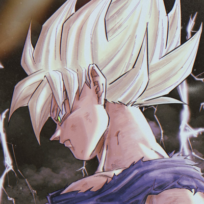
I have added Themes to suit each game in the series, this is nowhere near its final draft. I planned on lowering the intensity of photos and making it more greyed so you can read the text easier, I spoke with Hobz and he preffers the idea of a more subtle look with CSS. I was suggested to make a thread on this, do you like the idea of Themes or ? and if you do and want to suggest images please let me know :)
I'll sum up some of my quick thoughts here before I go to bed and hopefully be able to explain in more detail if people have questions:
-
Thank you SO MUCH for being proactive Sally. Cannot stress that enough. Easiest way to make these things look nicer and more professional is to just make changes without fear of being wrong and then iterate from there. I've been wanting to finish up the cover images for a while, but I'm pretty slow/horrid with GIMP, so it's been holding me back. Cannot stress enough that no matter how much I may disagree with factors, I very much appreciate you taking the initiative to change things.
-
I am not a fan of background images in general, but especially as full-screen stills from the game. To make background images look even kind of decent, they first need to be at least 1920x1080, which slows loading for everyone and does not support different sized windows very well. In addition, it makes text harder to read and gives the boards a more "Geocities fanpage"-type look.
-
I am much more in favor of subtle changes that fit the individual games using background/text colors that are still readable but give a slight personalized look. I also think Google's Material Design is a great layout to follow, but I'm not exactly sure how much of the site is customizable via page CSS yet, so we may only be able to tweak colors. I'll look into this.
-
Consistency is key. Games should be individuals but all clearly tied to the full series. With that in mind, our cover images need to be more consistent. Two main factors are inconsistent right now: a) Some HD games use the collection logos (KHFM HD uses 1.5), others use the Final Mix logo with "HD" added to the logo (KH2FM HD), and b) Some games have the text from the Japanese logo for their JP versions, while others have "(JP)" added to the English logo. a) I prefer the latter option here, where we use the game's Final Mix logo with "HD" added. In these cases, however, we need to be careful to match "HD" as closely to the collection logos as possible. b) In this case I prefer the former option, where we use the Japanese logo. From personal experience, I know the Japanese logos can be incredibly hard to find in the correct format, but we should be able to recreate any that we can't find suitable images for.
Please let me know if any mocks get made as I can write up any CSS we need for the pages within a few minutes.
Oh also, ideally all Japanese versions of the games should come first in the list order, but it is not that way currently due to a technical limitation of the site (only being able to provide release years for games, not dates). A future update is planned that will include full dates, which will fix that problem.
I love the new themes Dax has been creating. They hit each point of mine from above:
- Woo more proactiveness!
- The images are 1920x1080 but are dark enough to read text on easily. That being said, they do fuck with viewing the site on mobile quite a bit, but speedrun.com doesn't have a mobile site as it is right now, so not really much of a worry.
- Very subtle images imho. I didn't even realize there was a background on one of the pages I was reading for a good couple minutes.
- Consistent theme across all games but with a unique twist for each. Perfect.
Logos still have to be made consistent and CoM + KH2 still need themes, but other than that we're sitting in a much better place! I might mess around with modifying some text colors slightly via CSS on some of the pages, but in general I think they look great. Thanks again Dax and Sally!
P.S. I'm not a fan of the "KH font" speedrun.com logo. Not because I don't necessarily like the idea, but more because every single KH font I've looked at just isn't very good. Additionally, it somewhat sends the wrong message from a usability standpoint since that link goes to the main SRcom homepage and not the KH series page.
Made all new logos for the games. http://imgur.com/a/TGSAc
there are a few extra thrown in, just in case if DDD Japanese,re com Japanese, etc.. end up becoming a thing.
Also made a Final Mix HD text for the collection games, its not "Perfect"
Replaced the top text and symbol to white ones.(Contrast against the grey background on the home page)
All of the Japanese text is custom.


