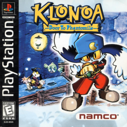
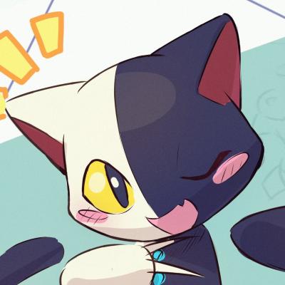
A few weeks ago, we had started brainstorming ideas about customizing the looks of the DtP and L'sV boards. What you currently see is our finalised concept, and we would like to know what you think of it. Thanks to Nazzareno for his continued help with this.
Are you okay with it ? Is there a problem, or/and are there modifications to be done ? Ideas ? Do you think that it goes against the spirit of night mode ? Comment your opinions below.
[FORGET ABOUT THIS] I'll leave this open until this saturday at 23:59 (roughly four full days from now).
I personally like it, but I remain worried that it could be too bright, or have too much blue for night mode users. Maybe we could do something similar to that of the Wii, or the Katamari Damacy Reroll board as an outsider example (though, other boards of games of the same serie seems to not care about that).
Yes, it looks too bright for me. Nothing to complain about the image itself or add besides that, maybe something more game related? like a stage background
Done a lot of testing today, and found two new candidates. They're all regrouped here, and what you're currently looking at is the second one : https://imgur.com/a/qr6U8ZD We could add custom trophies, but I personally have no idea about what could fit in.
I have decided to not close this thread, as well as the other one dedicated to L'sV. Leaving them open doesn't hurt for this kind of topic.
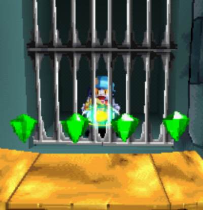
For custom trophies a green gem, blue gem, and extra life would work
Why not. In any cases I personally won't have time to work on it (besides maybe taking a high res / close up picture of them if needed), so I can only leave it to you guys
It sounds great! I can prepare the icons, if you wish. Is there any specific resolution they must be in?
Src doesn't really say anything about the resolution. I tried and was successful in uploading a 634x450 size file, and from the customisation menu it displayed fine, but it wasn't doing that in the public board. But we probably just have to wait for the site to work it out, like for my cloud issue. So it'll probably work whatever size you put
We also got to upload the trophy icons. Most of the doing happened on Discord.
It's a bit too late to say something like that, but I remember Elsiz's approach, where he used both small and large dreamstone's normal and doubled up sprites as icons for all four first places. He even went for the trouble of making gif animations of them. He had asked for them to be removed, so it's not a thing anymore. But we could make it happen again if we want. That, even if we don't go the extra mile with them being animated.
Else, for a 4th place trophy, maybe we could have a small heart collectible ?
Changed the spinning small health pickup to a still, winged version (all of them source files, pieced together by Amoser). With that, trophy customisation are done.
...There might still be a problem left to solve, a human-nature nitpicky one. The 4th trophy doesn't line up well with its surrounding. The wingless version would likely fix the issue, unfortunately that one only displays when you pick one up, so it could be unfamiliar looking. Plus, it is of slightly lower quality than that of the winged version, even within the source files. No sweet spots imo.
Maybe unless we modify the files of the three other trophies so that with clever positioning, they all (roughly) line up to one another.
Updated the background to be ~~0.3 mb heavy instead of 1.7, so it should load 5x faster Mistakes were made
It's true ! It has been done ! After more than 25 years ! A new dimension of play for this game is now upon you !
All four categories ! And submissions compatible with full-game run footage ! So you can port all of your best and proudest stage performances !
You can read about the making of start
