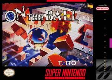
Hello,
I recently made minor changes to the styling (plan on doing a lot more) and I just wanted some feedback. This post will be edited when I do more with the site, but I would like feedback on the following changes: (I have included links to the image resources within this document as embedded BBCode)
Favicon - This should be simple enough, it is just a high quality image of our favorite ball. I think it accurately captures the spirit of the game.
Trophies (Bronze , Silver, Gold) - If you don't know what these are, I'll be a bit disappointed. Think of the Japanese cover. I'm very happy with these.
Site Logo - This one might be hard to picture, but I got access to the game's resources and found the font used throughout the game. I originally made the logo using all the colors available (click here) but I found it to be an eyesore, so I stuck with the black and white font to be most similar to the actual speedrun.com logo. I also experimented with a drop shadow and decided I didn't like it (click here). If you are interested in the other colors, I have an image of the in game font (click here). Here are some examples (Exhibit A, Exhibit B) of the font at work in the actual game.
That's it for now, all feedback is welcome!
Whoops, all these images were broken haha.
Also, if you guys have any feedback or suggestions, let me know


